"It’s a nightmare" - Jeremy Hindle talks about VFX blood and more, on how he created the set for Severance season 2 finale
It has been more than a month since Severance season 2 concluded on Apple TV+. Similar to the show's inaugural season, the second instalment of the series also garnered significant critical acclaim and audience popularity.
Some of the parameters based on which Severance season 2 was appreciated were its writing, direction, performance, music, and cinematography. Another aspect held in high regard in the series was the set design, intricately planned and executed by production designer Jeremy Hindle.
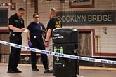
In an article published on March 21, 2025, on the New York Post, Hindle spoke about the process of designing the set of Severance season 2. Talking about the excessive amounts of blood in the concluding episode of the season, Hindle said,
“We do a lot of VFX blood … But the blood on them and around them – it’s a nightmare, it’s not fun. It wrecks floors and walls — it’s a bloodbath."
Is Severance's color palette a nod to The Matrix's red pill and blue pill aspect?
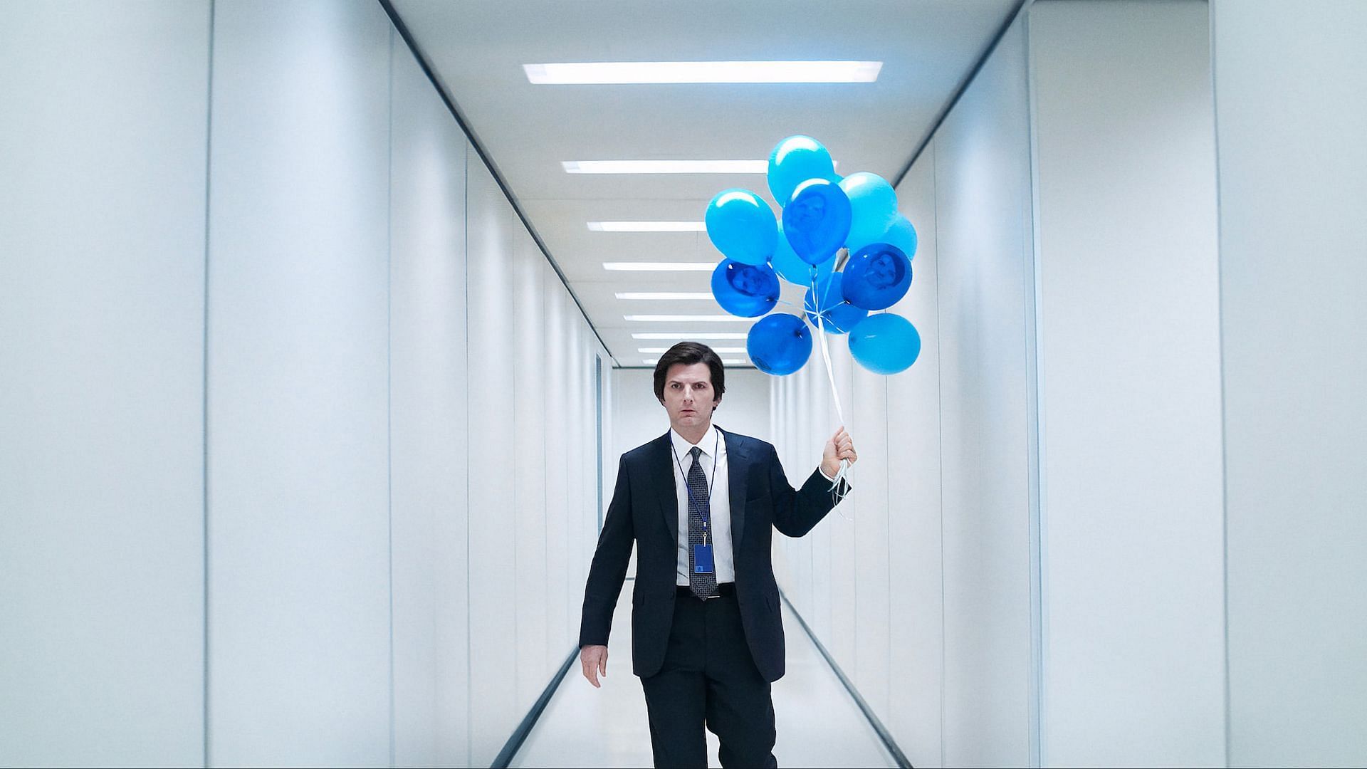
Severance is very strict with the color palette it uses. It mostly pivots between the colors green, red, and blue. For Severace season 2, the palette was primarily blue. This decision was made to ensure that the show's authenticity is preserved.
That being said, there have been several ongoing theories that suggest that the show's choice of colors is derived from The Matrix's red pill and blue pill theory. Production designer Jeremy Hindle, while speaking with the New York Post during an interview, mentioned before, debunked this theory. He said,
“No. It’s more internal. It’s more of a feeling [that colors give you]. The funny thing about this show is we all have a lot of ideas, but we don’t discuss them all. We all do our own jobs. And those things start to merge together and then stories come out of them.”
He also spoke about the difficulties of working with multiple directors on the show and "trying to make sure that the look stays the same." A strong reason behind that, he revealed, is “because a lot of the rules for the aesthetic" are in his head.
Talking about how he approaches each scene of the show with the outlook of it being Severance coded, Jeremy Hindle said,
“It’s just trying to make sure that those things don’t escape the code of ‘Severance.’ I say it a lot, like ‘that’s not “Severance.”‘ You take a lot of risk and fight a lot, they wonder ‘why does it have to be this?’ and they don’t know until after they’ve seen it.”
What does the color red in Severance season 2 signify?
The color red is very selectively used in Severance season 2. It is primarily used in scenes that depict feelings of love. Production designer Jeremy Hindle allegedly fought for this color scheme, as highlighted by him in his New York Post interview. He said:
"This season, everything’s blue. The only time we see red — I had to really fight for it, red is only when it’s love. It really is that simple. In the Chinese restaurant, is it love? He’s in love. In the tent, there’s just tiniest bits of [red]. When there’s real love, there can be color now. Or if it’s blood, it’s the same, that lifeline.”
Also read: Where is Severance season 2 episode 4 filmed? Production details and more.
All episodes of Severance season 2 are currently streaming on Apple TV+.